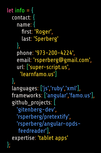
 As I’ve been applying for JavaScript dev jobs, I’ve been gradually tuning my LinkedIn page and resume, and last week I bent my business card toward contributing to the correct first impression — that I’m a developer the hiring manager wants to meet.
To this end, I wanted to put some information on the business card that doesn’t normally reside there, things like the languages I know, GitHub repos and the JavaScript frameworks I’m familiar with.
Having stumbled across JSON Resume recently, I realized I could easily represent this information as a JavaScript object without making the labeling seem obtrusive or out of place. Thus was born my JavaScript developer business card, whose details I share here for any developers who might want to use my work as a template for making their own similar cards.
To extend the conceit of putting information about JavaScript in JavaScript notation, I decided the card should use a programmer’s font, with syntax highlighting and a black background, the way such content appears in my text editor (the admittedly sublime Sublime Text 3). Although I admire and have contributed to Source Code Pro, Paul D. Hunt’s superb monospaced font, for this card I make use of Share Tech, a sans-serif font by Ralph du Carrois based on his design of the Share font family and closely connected to Share Tech Mono. Essentially Share Tech utilizes the Share Tech Mono glyphs but not monospacing; this means more characters fit on a line, and on my card only a single entry in the property-value pairs in the info object is split between two lines.
Production choices
I use a color scheme that goes beyond my own (private) syntax-highlighting NextUp.tmTheme: #ff5599 (light pink) for keyword1, #2aff2a (vivid lime green) for variable names, #ff7f2a (vivid orange) for punctuation, #37c8ab (moderate cyan) for brackets, #e3dedb (off-white) for properties, #ffd42a (vivid yellow) for strings and uri’s, and #5599ff (light blue) for items in an array. (I’ve borrowed these color descriptions from ColorHexa, “a free color tool providing information about any color,” which I cannot praise enough.) Of course, no printed ink is ever truly “vivid,” so the physical business card is but a pale simulacrum of one’s text editor.
The proportions of this business card are not the traditional 2in-by-3.5in but instead the “slightly boxier” 55mm-by-84mm offered by Moo, the “award-winning print and design company specializing in premium business stationery and promotional materials.” Moo charges more than I want to pay, but everything about their work and products that I’ve seen is flat-out remarkable (which is why I indulge their puffed-up self description). I like the sturdy feel of Moo cards, so that’s where I now have my business cards printed.
The source files
You can access the SVG files that I used as a gist. I created the design in Inkscape and generated the PDF’s that I sent to Moo from Inkscape.
The SVG file for the back of the card is located at https://raw.githubusercontent.com/rsperberg/rsperberg.github.io/master/assets/svg/js-dev-biz-card-back.svg (and at the gist mentioned above).
Here is a cleaned-up version of the SVG that Inkscape creates (I’ve removed the image preview, unused layers and redundant style information for readability):
The <tspan> elements specify where each line’s rendering is positioned; but if you did not wish to use Inkscape or some other vector-graphic editor to modify my file with your details, you can simply edit the text within the <tspan> tags to make your own card. (Theoretically. This modified file works beautifully with Inkscape but Chrome and Safari both render it differently than expected.)
Here is what the other side (the front) of this business card looks like. The SVG source file for the front side is located at https://github.com/rsperberg/rsperberg.github.io/blob/master/assets/svg/js-dev-biz-card-front.svg as well as part of the aforementioned gist.

Obviously centering a title and catchline on a business card-sized template can be done in many programs. For consistency, black remains the background color. Share Bold is used, since Share Tech lacks a bold weight.
last updated: March 31, 2015
 The main art on this page is a word cloud of Roger Sperberg’s resume that was created by Tagxedo, using MKorsair, Franchise and Duality fonts, a custom rectangular shape dropping out the characters J and S, and the Wanderer color scheme (which I created and contributed to Tagxedo). If Wanderer doesn’t show up in Tagxedo, you can submit your own “theme” using the same colors: #087CF4 #D40A5A #FDC20F #03D518 #03B5D5.